April Tan

CCE Website:

Full website redesign and revamp for a better user experience

The Center for Communication Excellence (CCE) is Iowa State University’s go-to website for graduate academic support. Housing everything from event schedules to appointment bookings means that an intuitive, user-centered navigation is an absolute necessity! 

Date and Type

UX Project
December 2019 – Present

Research Methods

Usability Testing, Think-aloud Protocols, Semi-Structured Interviews, Wireframing, Prototyping

Role

User Researcher, Front-End Developer, UI Designer

TLDR;

Overview

I set out to find the root cause and to revamp the website based on user feedback. The current redesign has seen an increase in positive sentiment, user satisfaction, and link click-through rates. While this website is going through a second round of iteration, please check out thecurrent CCE website here.

Highlights

  • System Usability Score (SUS) increase from 35 to 67 
  • Click-through rates (CTR) increased from 1.4% to 6%

Current Design: A Work Still in Progress

The redesign of the website revolved around 3 main user insights in the first round of iteration: the lack of information organization, the need to access services quickly, and the frustration with redundancy.  The current design thus features a navigational bar at the top of the page, features prominently used services on the homepage, and uses composition and typography to visually group information. 

Before After

Drag the slider to check out the before and after. We love a good makeover.

Discovery: Conducted usability testing, SUS scoring, and user interviews with 4 frequent users; stakeholder interviews with 4 admins

I first interviewed the director and staff of the Center for Communication Excellence (CCE) to understand stakeholder needs on the administrative side. Then, I interviewed 4 graduate students who were frequent users of the CCE Website. Following that, I conducted a usability test by having them complete three tasks on the CCE website while using the Think Aloud Protocol.  After each task, each participant scored the task on the SUS scale.

Semi-Structured Interviews

CCE stakeholders were asked 5 open-ended questions centering around administrative needs and success measurement.  CCE Website users were asked 10 open-ended questions about their needs, behaviors, and sentiment.

Usability Testing and Think-Aloud Protocol

Each student was give 3 tasks to complete and asked to verbalize what they are doing and thinking as they completed the tasks. All tasks were reported as key priorities by the stakeholders:

  • Find out the types of services the CCE had to offer
  • Make a writing appointment
  • Search for an event that looks interesting and sign up for it

Insight: Students wanted to understand and access helpful services quickly
without having to wade through irrelevant information

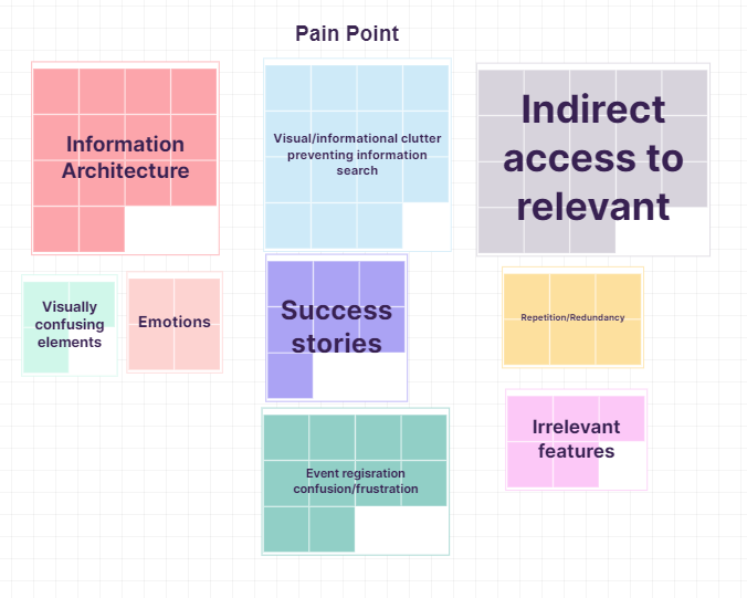
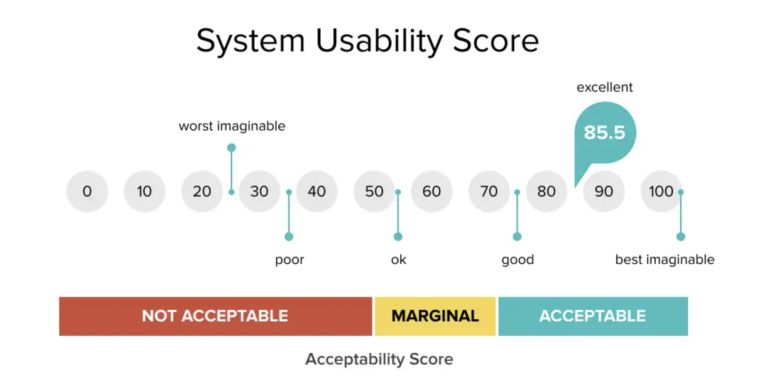
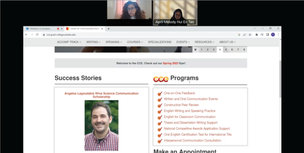
All 4 users failed the first task, which was to accurately identify all of the services and programs provided by the CCE. Students had a hard time understanding how the CCE services and programs were categorized. Observations included frequent backtracking and trying to parse out differences in categories. Think aloud also revealed comments like, "Wait, why is this here?" and "Huh? Oh it's the other one."

This prevented information search. All 4 users took a long time to complete the third task, which was to find an event they are interested in and to sign up for it. Observations revealed indicators of stress whenever they encountered a page with a wall of text. They would also say things like, "Why do I have to read through all of this to get to what I need?" and "I'm scrolling and scrolling but where is it?"

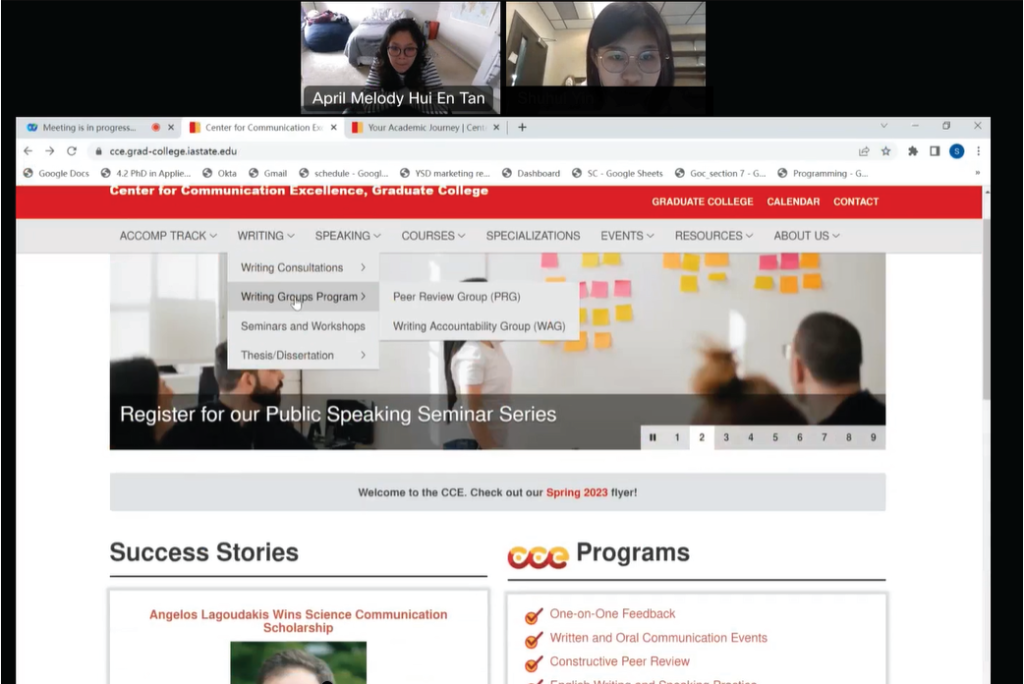
All users took a long time to complete the second task, which was to make a booking appointment. Observations revealed that the quickest path was 5 clicks and that the links were not labelled explicitly. This gave way to comments like, "I thought this was a header until I hovered over it."

Affinity diagramming workflow based on observations and interviews

"I've never been able to find the booking system on the first try. Why is there so much redundant information?"

User #4

Always Lost

"This looks like it was made in the 90s. Everything is cluttered and hard to read. Oh wow. Yeah, I'm not going to read all of that."

User #2

90s Website, not in a good way

Development: Wireframing and Hi-Fi Mock-ups tested with 4 users

How might we:

  • only show students the information that they want?
  • reorganize program information while maintaining the internal structure for administrative purposes?
  • provide quick access to links and pages?

Wireframe Sketches

10 wireframe sketches with a focus on orienting users were tested with 2 students and 2 CCE staff members. 

Hi-Fidelity Mockups

2 hi-fidelity mockups were created in Adobe XD and tested with 4 students. Qualitative responses were collected.

Solution: Landing page with a main navigation bar and quick links to access popular services

Main Design Features

A final design was chosen based on A/B testing for navigability and organization. Iterative design changes were made based on user comments. I then proceeded with the front-end development of the final design, making sure to adhere to brand and accessibility guidelines. 

  • A main menu bar with drop downs to help with navigation
  • Creating primary and secondary sections to help with  information organization
  • Creating quick links for ease-of-access
  • Featuring key programs and services first
  • An image carousel to help feature promoted events
  • A notification bar for important updates 

Testing: New landing page saw 22 point increase in SUS score and 4.6% increase in click-through rates

Another usability study was conducted with 4 new users using the new interface with the same 3 tasks. Users were once again asked to use the think aloud protocol as they were completing their tasks. The findings are detailed below.

SUS Score Increase

A/B testing was used on 4 users to test the usability of the new website. The new interface scored an SUS score of a 67, a 32 point increase from the old design.

Link Click-Through Rates Increase

One month after redesign launch, the click percentage of the website links were examined. Link clicks had increased 4.6% from 1.4% to 6% previous month, indicating a follow through from website visit.


Testing: Users still confused by organization and frustrated by visual clutter

Still confused

All 4 users still reported confusion about the organization of the website. Users particularly struggled with how the navigation bar was set up and how programs were grouped:


“The homepage is really not well organized.”

“I think the links are not clear enough, I don’t know if it’s what I want or where it will take me.”

Still too cluttered

Users were confused by the what was featured on the front page. In particular, they did not like the “success story” section and disliked the number of drop downs:


“[Counting]. There are 8 drop downs…why so many? I think 3 is enough.”

“Half of the homepage is the success story, but I don’t really care about it.”

“What is this AcComp tab? Is it meant for most students?”

Reflections: Advocating for users' mental model as next steps

  • Understand user’s mental model for organization. The usability testing on the new system revealed just how little I understood about my user’s mental model. Future steps will include a card sort to see exactly how users are categorizing information in their minds, and using that information from there to better redo information architecture of the site.
 
  • Managing competing stakeholder and user needs. One of the problems that I encountered was having to juggle different needs across different groups. For example, the CCE director was very adamant that the services and programs remained organized in a certain way for administrative purposes, yet users repeatedly voiced how confusing that system of categorization was. A potential solution forward would be too advocate for user needs as the website will be student-facing, and perhaps providing a separate tab for administrative purposes.   
 
  • Scaffolding interview questions. Most of my questions started out too deep or too broad. I felt like there was a lot more I could draw out had I warmed the interviewees up a little bit. For example, instead of asking, “What is your experience with using the website?”, I could have asked, “The last time you visited the website, how was your experience? Could you describe it?” As most participants have little UX experience, I will scaffold my questions in the future to help guide participants in talking about their experiences.