An interface revamp for a more integrated workflow
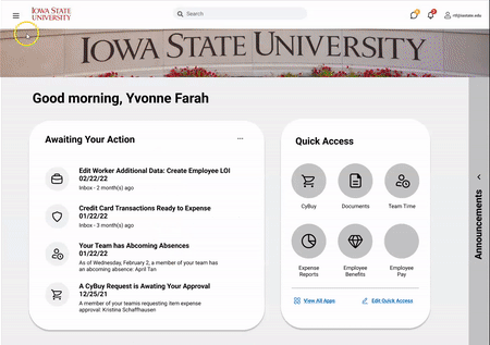
Workday is a complex, institutional platform that impacts employees’ workflows at all levels. This prototype was redesigned specifically to minimize that disruption and to provide employees relief rather than additional stress.
Date and Type
Graduate-level Course Project
Jan 2022 – May 2022
Research Methods
Usability Testing, Think-aloud Protocols, User Interviews, Affinity Diagramming, User Personas, Sketching, Prototyping, Cognitive Walkthroughs, Heuristic Evaluations, Heuristic Task Analysis, Storyboarding
Role and Software
User Researcher, UI Designer, Data Analysis
Figma, FigJam
TLDR;
Overview
For a graduate course project, our team developed a Workday prototype for university students and employees struggling with the integration of Workday into their existing workflow. Due to the scope of the project, this case study will focus on employees as the user group. Overall, the prototype performed better on task completion time, number of clicks, number of errors, usability, and cognitive load.
Highlights
T-test showed a significant improved difference in the number of clicks
Increased SUS score of 85 with new interface against 35 with old interface
Improved task completion time of 144s against 339s
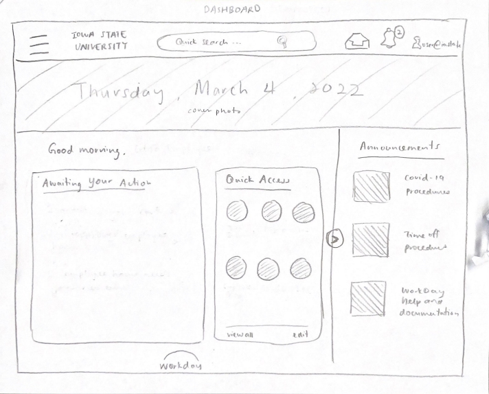
Workday Reimagined: A Tested Prototype
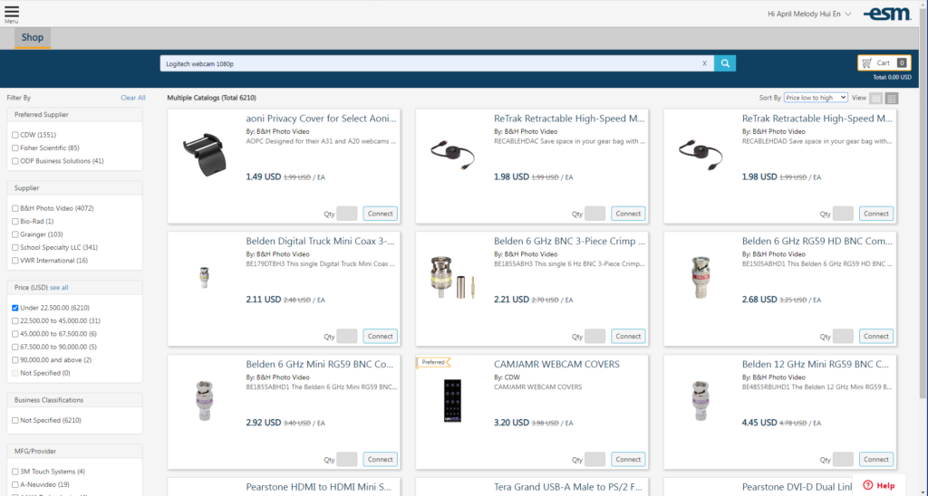
The prototype redesign of the website was created on Figma. This specific prototype was developed for university employees who were frustrated by how complicated Workday made it to purchase items from university approved vendors.
Discovery: Conducted usability testing and user interviews with 4 users to understand frustrations in context
4 users were recruited and asked to complete a task on Workday. The task was to purchase 5 Logitech Webcams with at least 1080p at less than $50 per unit from Iowa State’s Workday procurement center, CyBuy. During usability testing, users were asked to verbalize their thought process as they completed the task. If needed, I followed up with questions during the observations regarding specific behaviors. At the end of the usability testing, I conducted a semi-structured interview in which I asked them open-ended questions about their app use behavior, needs, and frustrations.
Usability Testing and Think-Aloud Protocol
Users were asked 10 open ended questions:
2 questions on values and motivation
2 questions of nature of tasks and needs
4 questions on workflow before and after Workday transition
2 questions on challenges with current interface
Semi-Structured Interviews
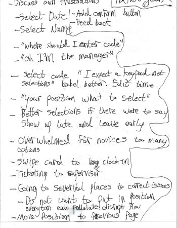
Things I took detailed notes of:
Shortcuts used
Navigation paths
Types of errors made
Indicators of frustration and confusion + associated task
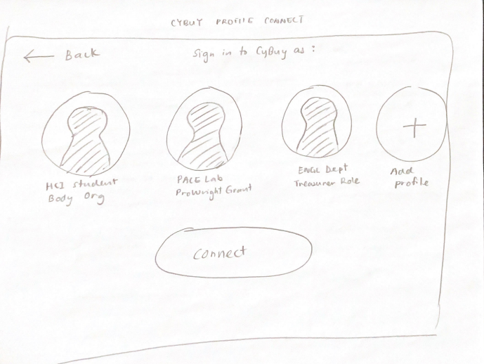
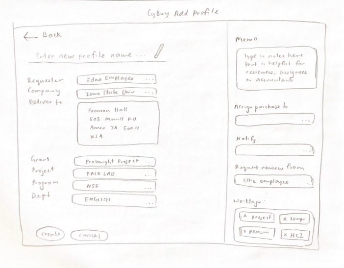
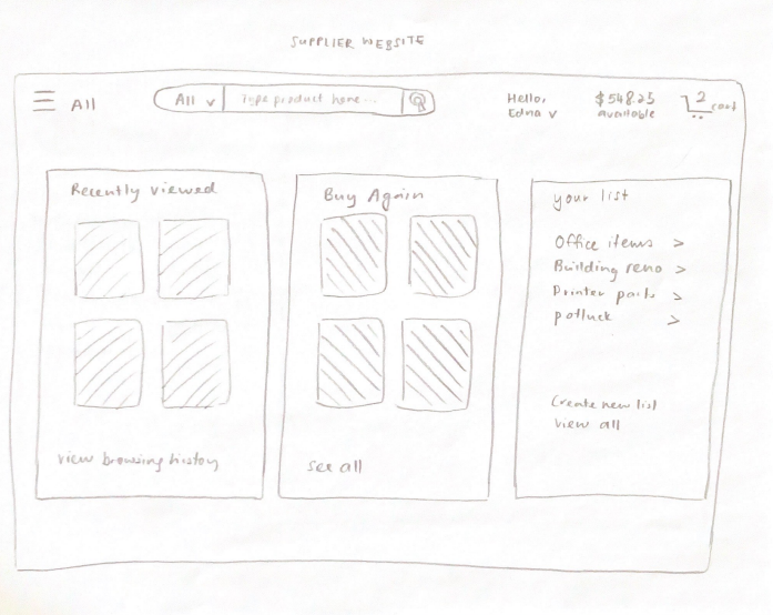
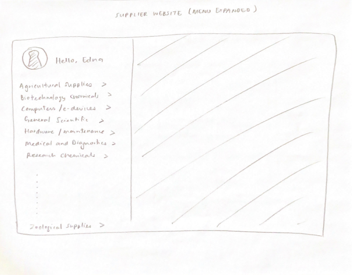
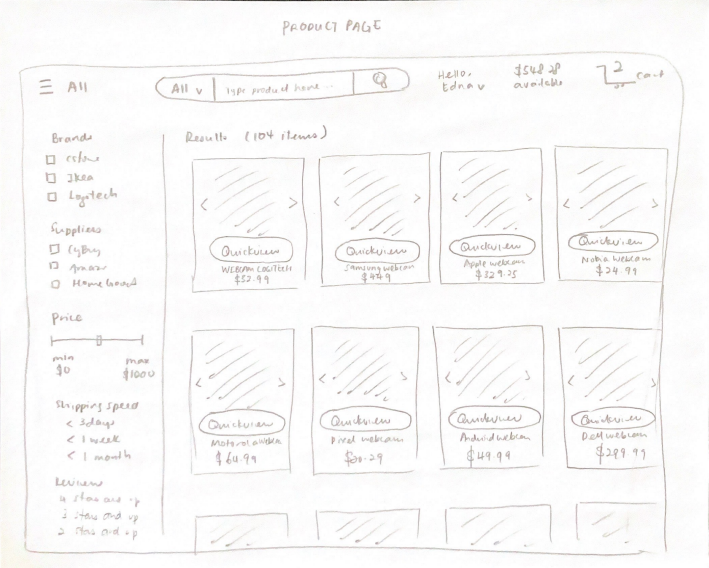
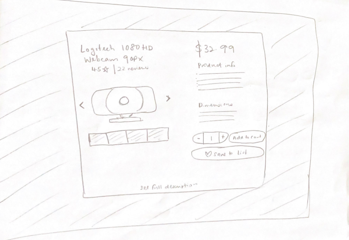
Screenshot of the CyBuy page
Interpretation: Employees find that Workday disrupted their existing workflow instead of speeding it up
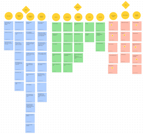
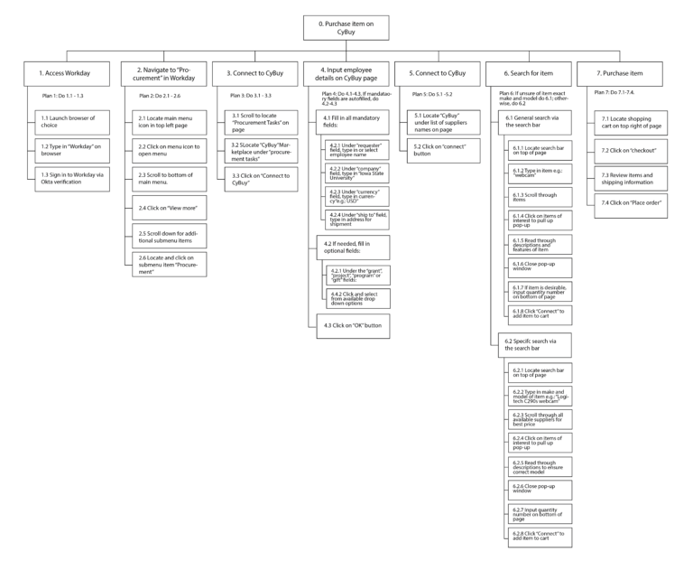
To interpret the data gathered, our team used affinity diagramming, a hierarchical task analysis, and a user persona. The affinity diagram helped us group our data and observations into 3 broad categories: pain points, wants, and tasks. Because many of the pain points centered around how inefficient the system was, we conducted a HTA to break down all required steps to the current workflow and to help us identify areas of inefficiency and improvements in the current interface.
Affinity Diagramming
Hierarchical Task Analysis
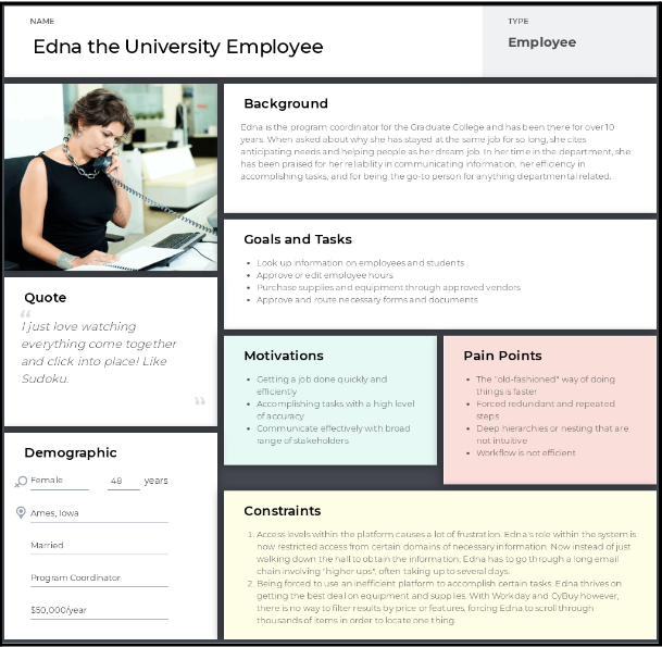
User Persona
Employees reminisced about the “old-fashion” way of doing things. As Workday follows a hierarchical navigational system based on levels of institutional access, much of employees’ time was taken by figuring out what they needed, from whom, and waiting to be granted access to the right files by the right people. Many noted how it was much quicker to walk across the hall to ask somebody a question or to retrieve paper documents from binders. In a nutshell, Workday interfered with their work instead of helping it.
Ideation: Storyboards and sketches were used for heuristic evaluations and cognitive walkthrough with 4 experts
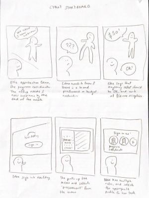
Storyboarding
I created a storyboard to help our team better empathize with what employees wanted and a scenario to demonstrate how they envisioned Workday improving their workflow.
Lo-Fi Sketches
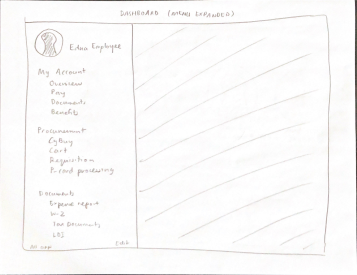
Based on the storyboard and the HTA, I started ideating sketches for the interface, focusing primarily on reducing inefficiencies and only including features that would be helpful. For example, including the use of “profiles” so that financial information would only have to be filled in once.
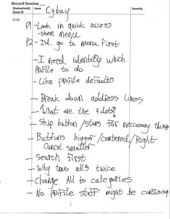
Heuristic Evaluation and Cognitive Walkthrough
We asked fellow classmates to walkthrough our paper prototypes and evaluate it against a set of heuristics as experts. We made detailed notes on what was suggested and compiled a list of required changes based on severity scale (with 1=minor and 5=catastrophic).
Examples of iterations made
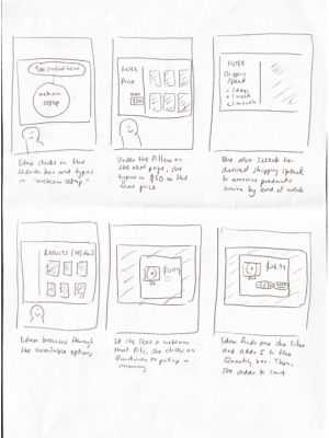
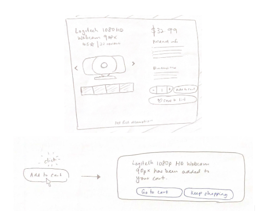
Fig 1. Users did not know when an item had already been added to the cart or not. To minimize gulf of evaluation and to let users know that state of the system, the solution was to add a popup dialog box letting users know when the item had been successfully added.
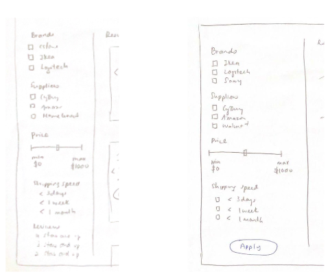
Fig 2. Users were unsure whether filters had already been applied or not. To minimize gulf of evaluation and to let users know that state of the system, the solution was to add an “apply” button to let users know the state of the interface.
Fig 1. Adding items to cart
Fig 2. Applying filters
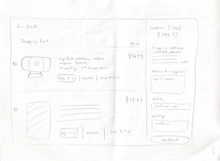
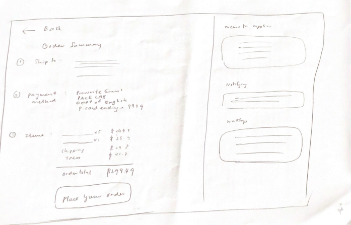
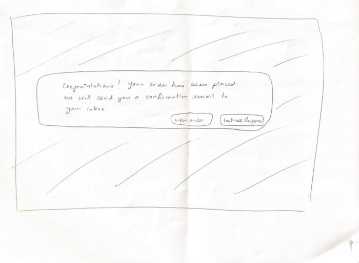
Solution: A system that auto-fills saved information, notifies necessary parties, and leverages familiar e-commerce interfaces
Try the prototype out for yourself! Purchase 5 Logitech Webcams with at least 1080p at less than $50 per unit from CyBuy. Click on full screen on the top right for the best experience.
Testing: Prototype outperformed in SUS, NASA-TLX and KPIs of task time completion, number of errors, and number of clicks
Users were once again asked to complete the same task and to use the think aloud protocol. Each screen recording was analyzed for task time completion, number of errors, and number of clicks. Additionally, each participant was also asked to fill out an SUS survey and NASA-TLX survey at the end of every task. T-tests and descriptive statistics were used to analyze the results.
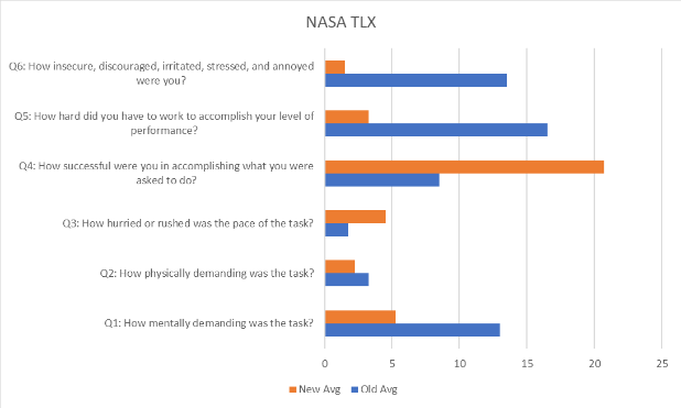
NASA-TLX Score Comparison
A/B testing was used on 4 users to measure the cognitive load of the website. Averages show that all 4 users rated our prototype as less mentally demanding that Workday’s interface.
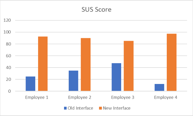
SUS Score Comparison
A/B testing was used on 4 users to test the system usability score of the prototype. All 4 users gave the prototype an SUS score of > 80vs. against an average of 30+ with Workday’s actual interface.
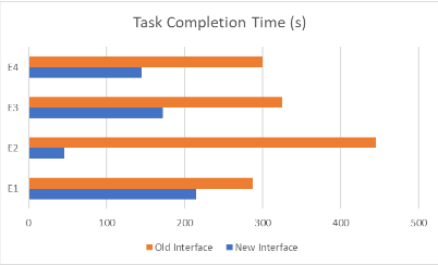
Task Completion Time Comparison
A/B testing was used to look at the task completion time of all 4 participants. This was deemed to be an important indicator as employees complained about the workflow being too slow. While the t-tests were not statistically significant, descriptive averages show that our prototype was faster at 145 seconds vs. 339 seconds with Workday’s interface.
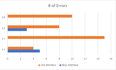
Number of Errors Comparison
A/B testing was used to look at the total number of errors all 4 users committed while completing the task. While the t-tests were not statistically significant, descriptive averages show that our prototype saw an average of only 2 errors vs. 9 errors with Workday’s interface.
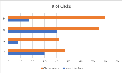
Number of Clicks Comparison
A/B testing was used to look at the number of clicks it took to complete the task. T-tests were statistically significant (p=0.03), with descriptive averages of the prototype seeing an average of 24 clicks vs. 61 clicks with Workday’s interface.
Reflections: Defining heuristics and success metrics
Define heuristics and users better for heuristic evaluation. The heuristic suggestions and comments from the experts were not as helpful as I hoped for them to be, but in hindsight, I should have been more concrete with what I was looking for or pushed for more expert analysis. Additionally, I could have provided them with the user personas or the storyboards to give them a fuller context of the user and use cases of the interface.
KPI choices should be grounded in user needs. While our KPIs weren’t necessarily bad choices, they were definitely chosen based on familiarity and convenience. I wish we had grounded our success metrics based on how our users were defining success. For example, employees wanted a system that would integrate seamlessly within their currently workflow instead of disrupting it. A potential KPI could have been a measurement of how users were perceiving prototype as achieving that standard.
Inferential statistics not useful with limited users. As we had limited time and resources, we were only able to recruit 4 users for this task. We initially thought that we would have enough data points even with the limited users. We unfortunately realized during data analysis that this was not the case — we did not have enough power to meaningfully comment on statistical differences or provide effect sizes, and ended relying on descriptive statistics to draw conclusions.