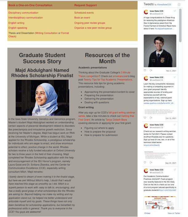
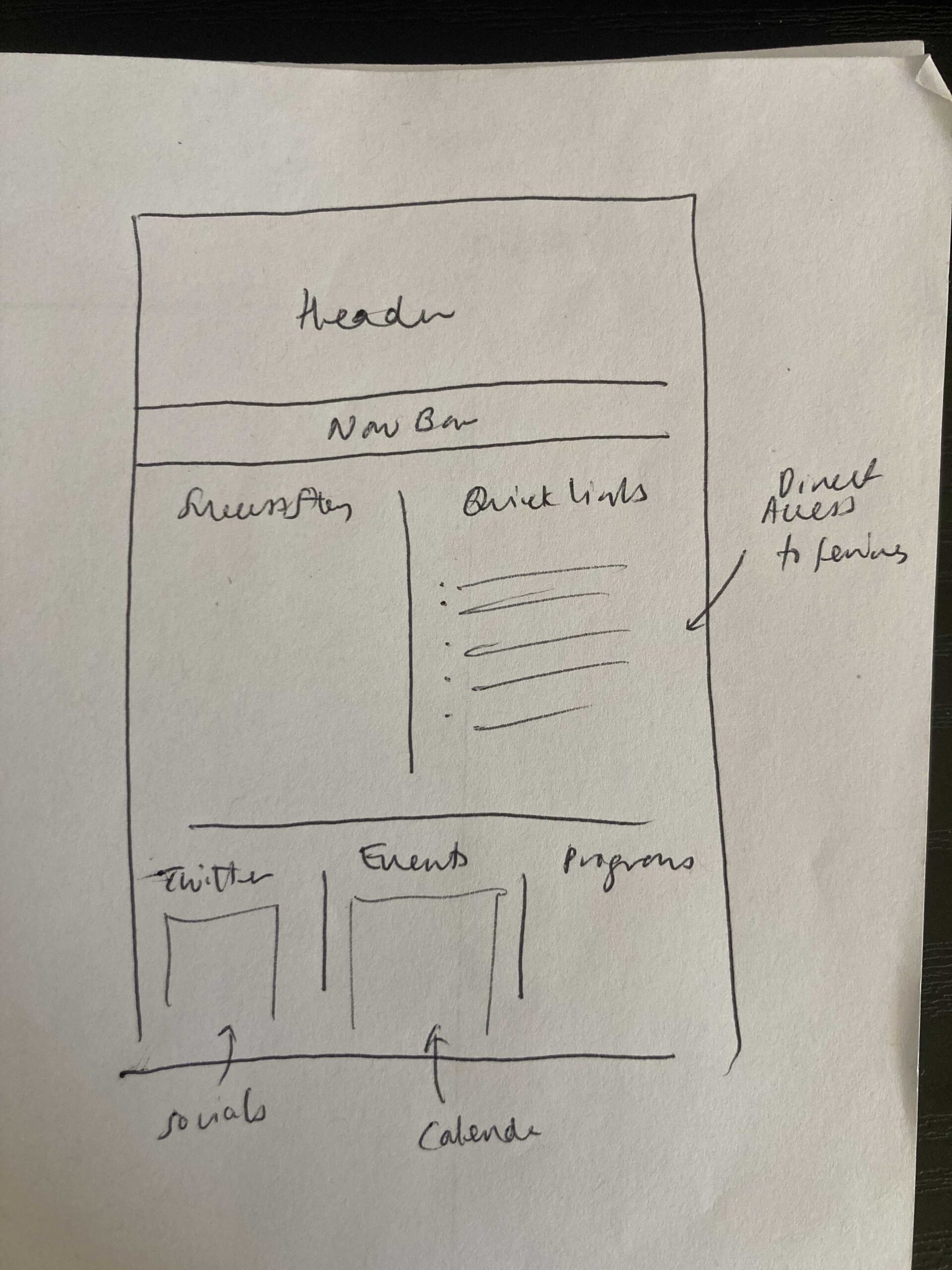
Before
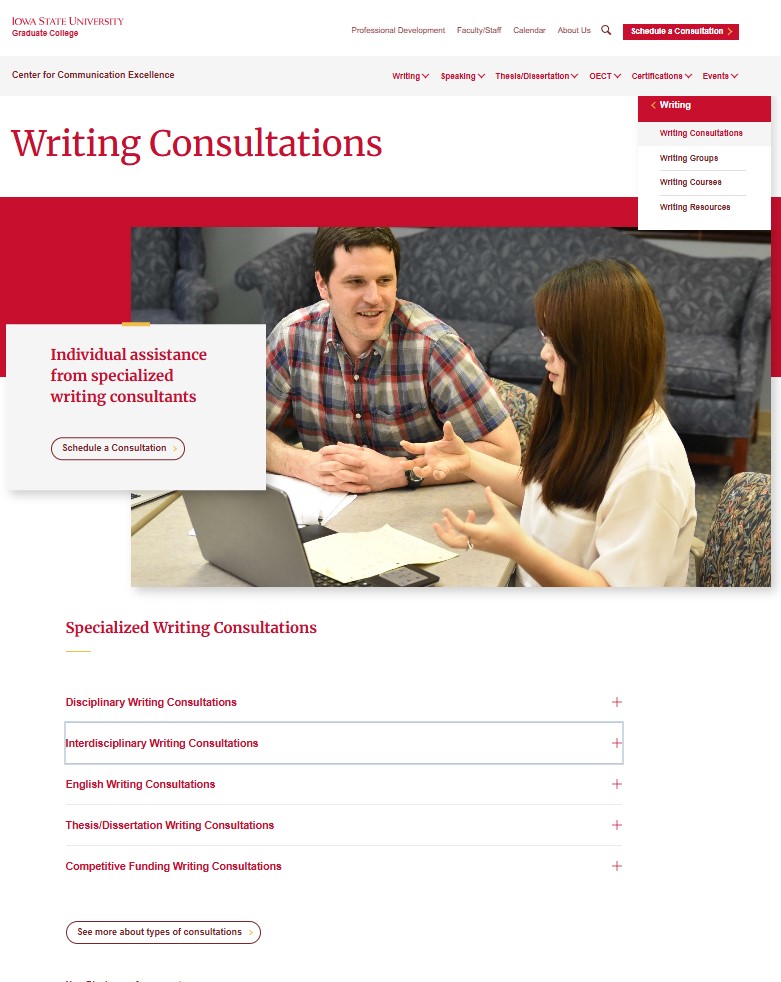
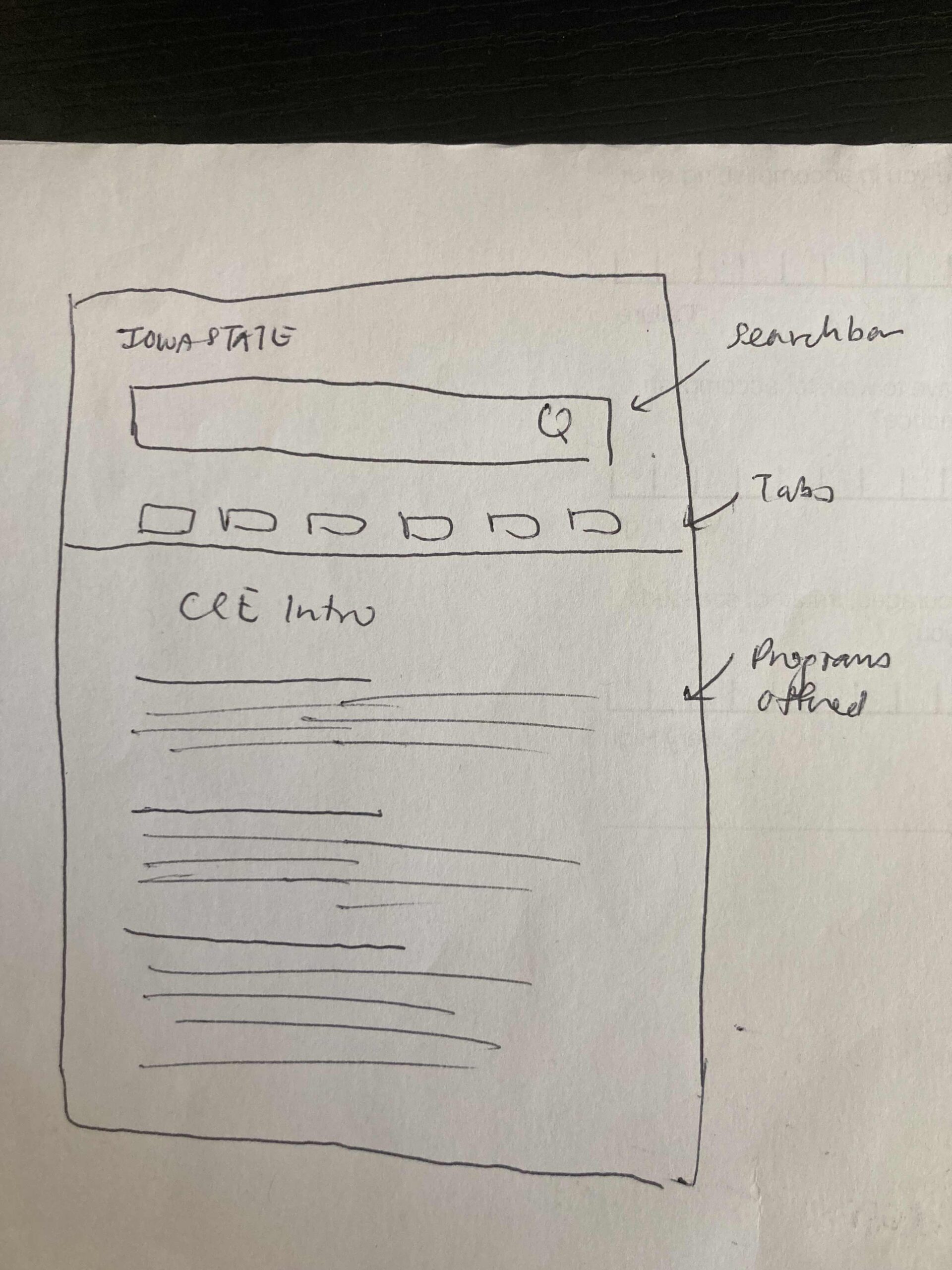
After
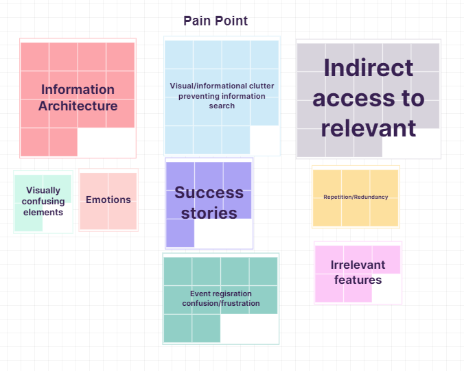
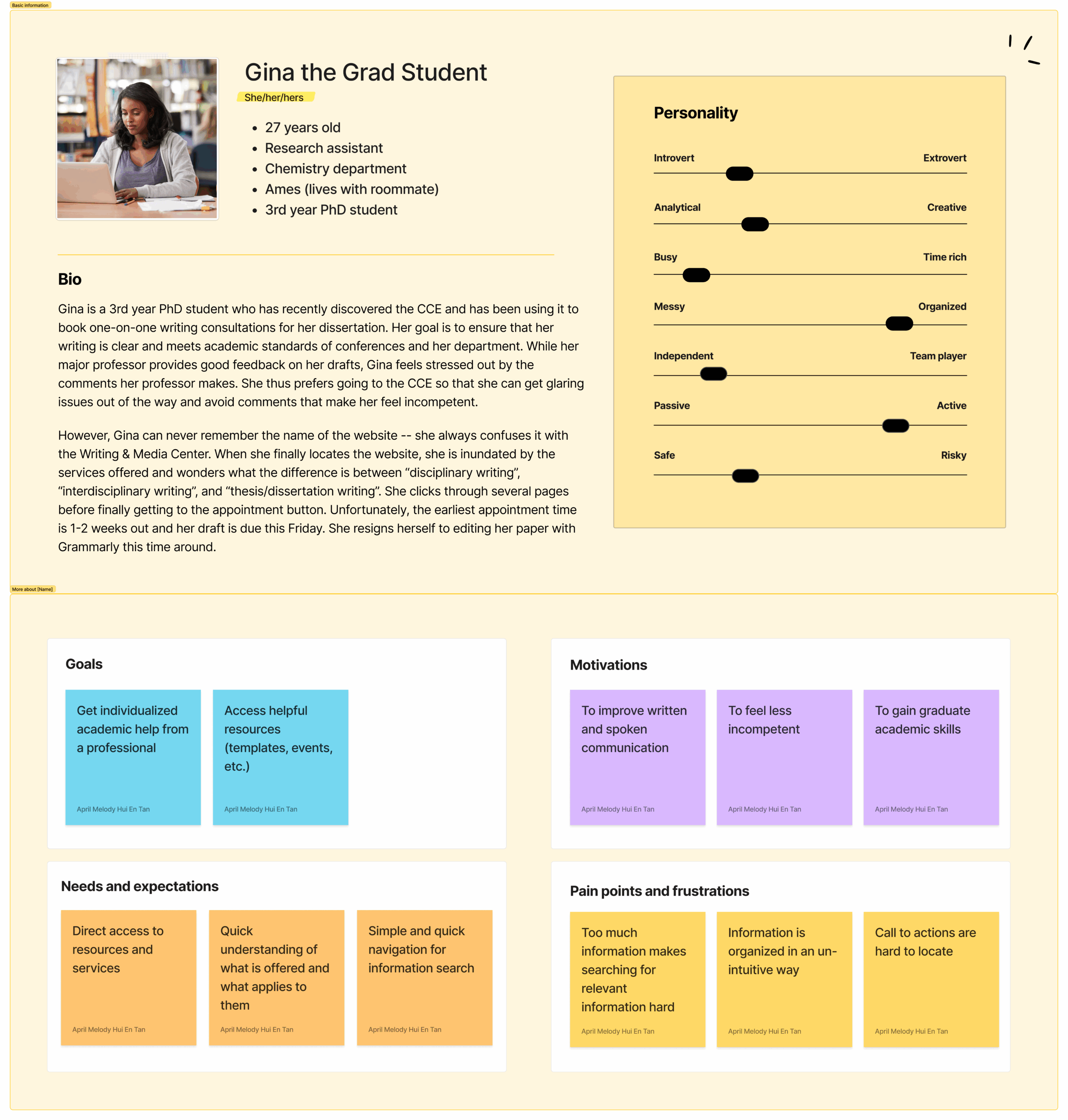
1️⃣ Conducted Exploratory Study
“I’ve never been able to find the booking system on the first try. Why is there so much redundant information?”
User #4
Always Lost
“This looks like it was made in the 90s. Everything is cluttered and hard to read. Oh wow. Yeah, I’m not going to read all of that.”
User #2
90s Website, not in a good way
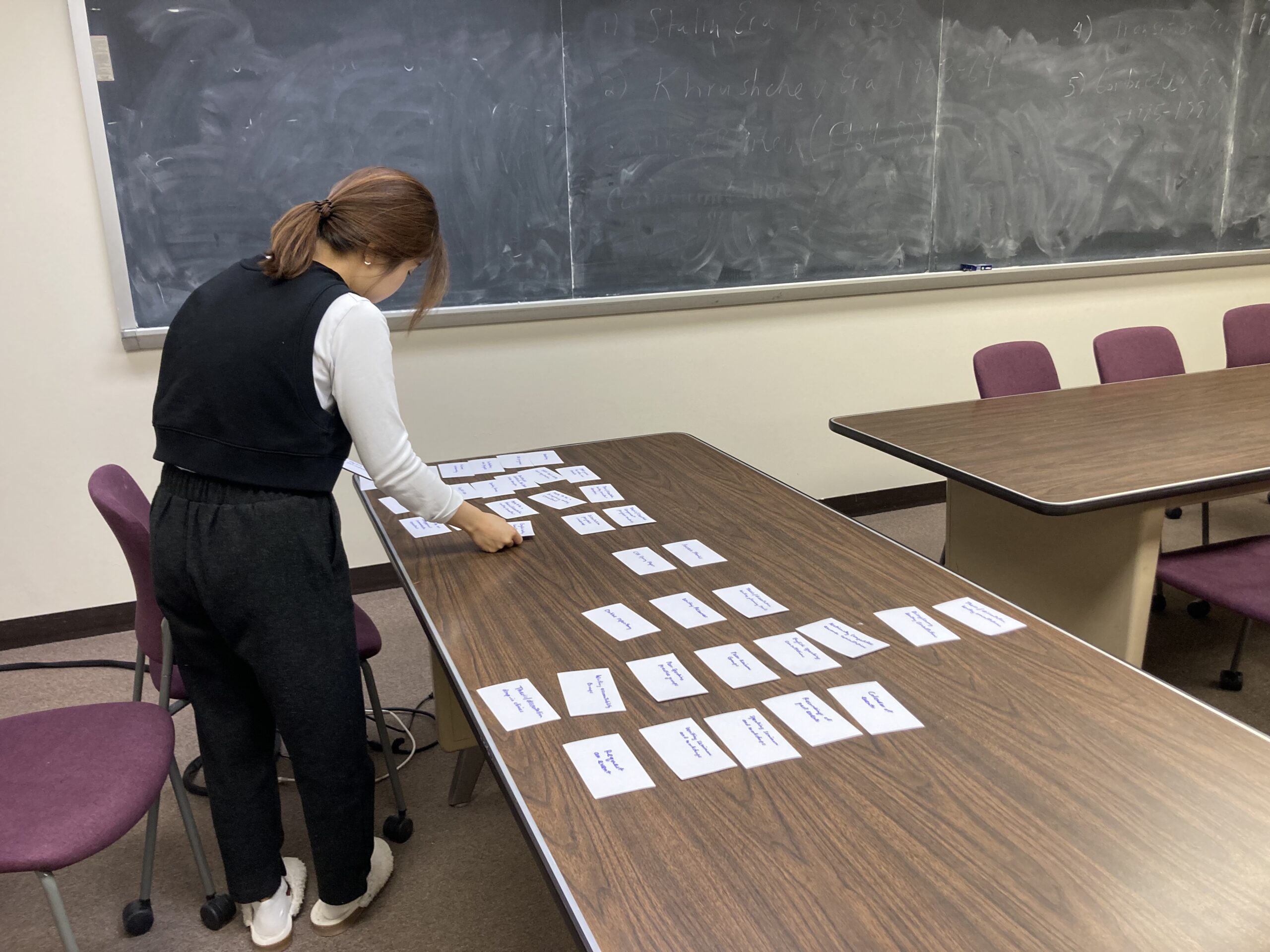
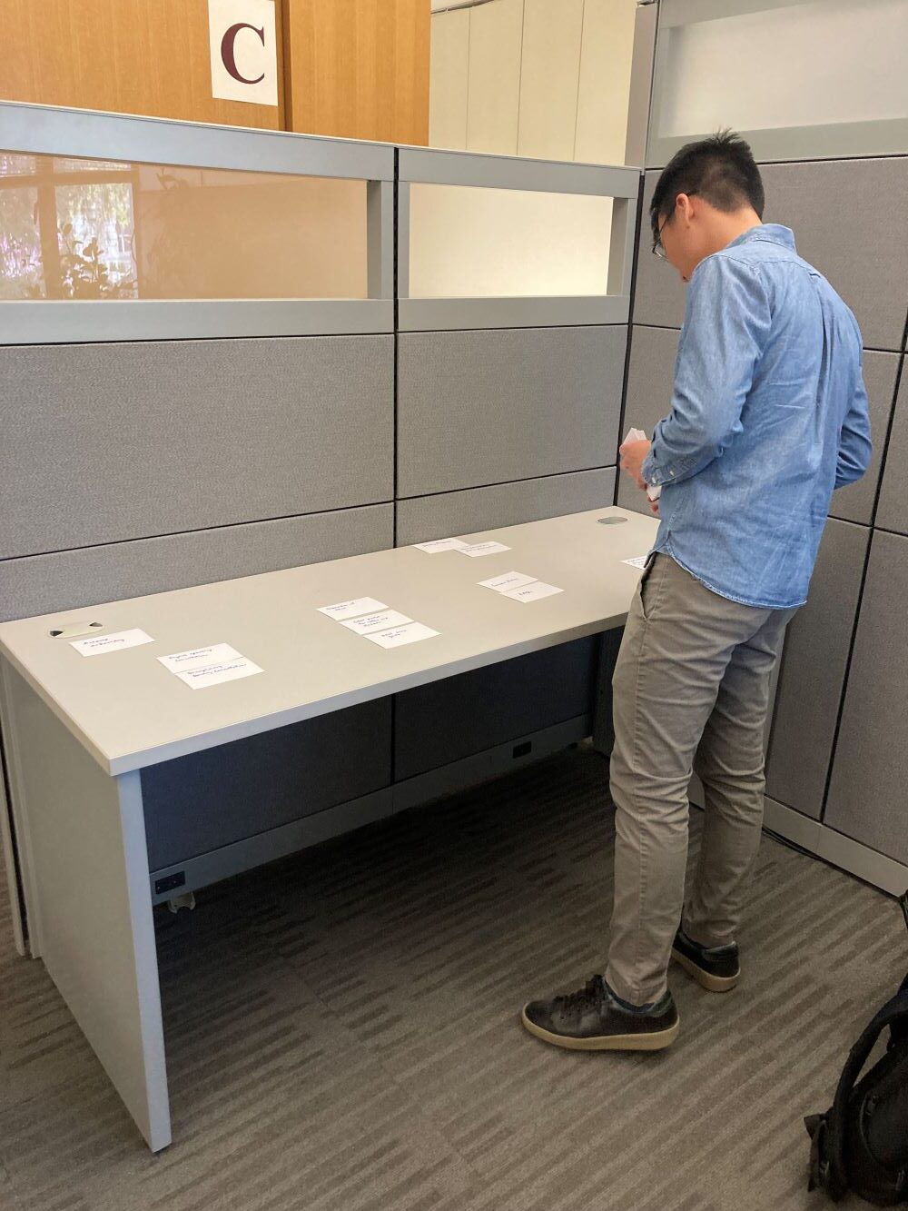
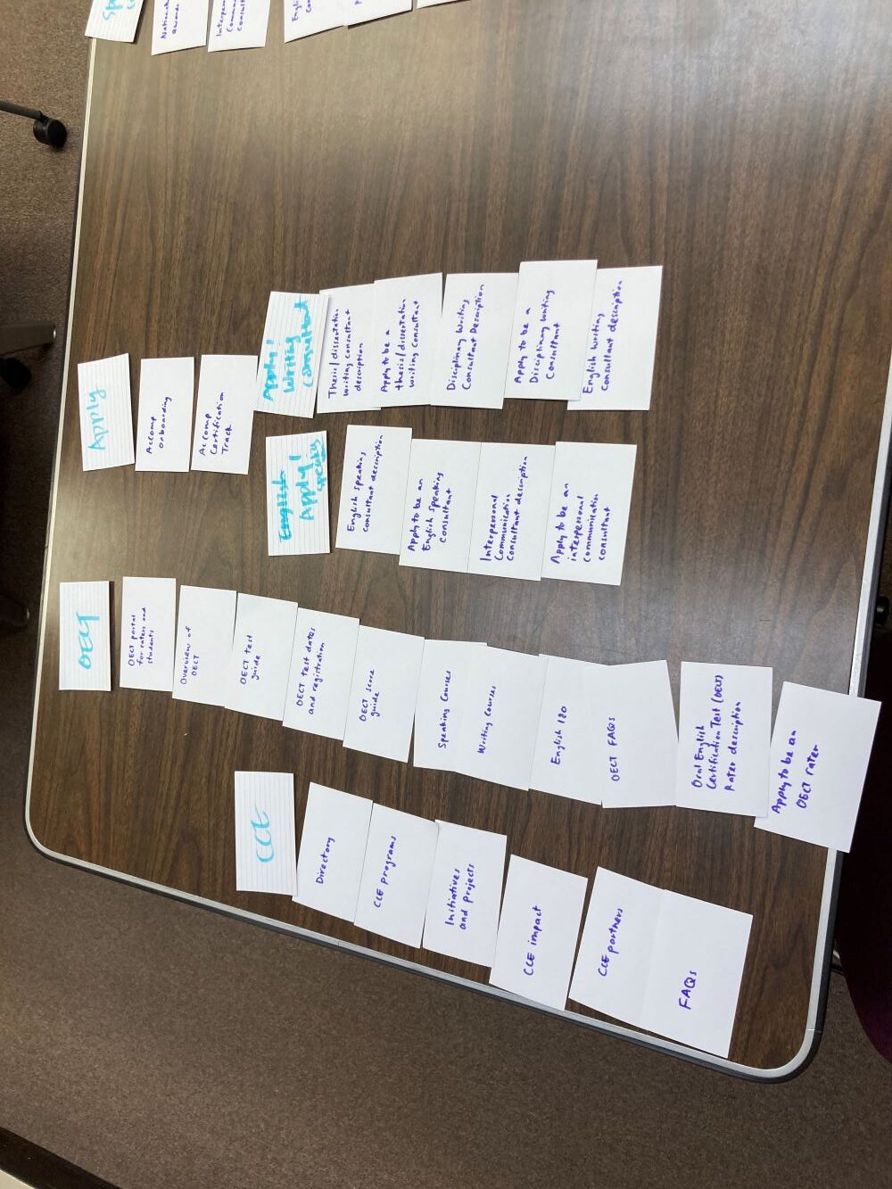
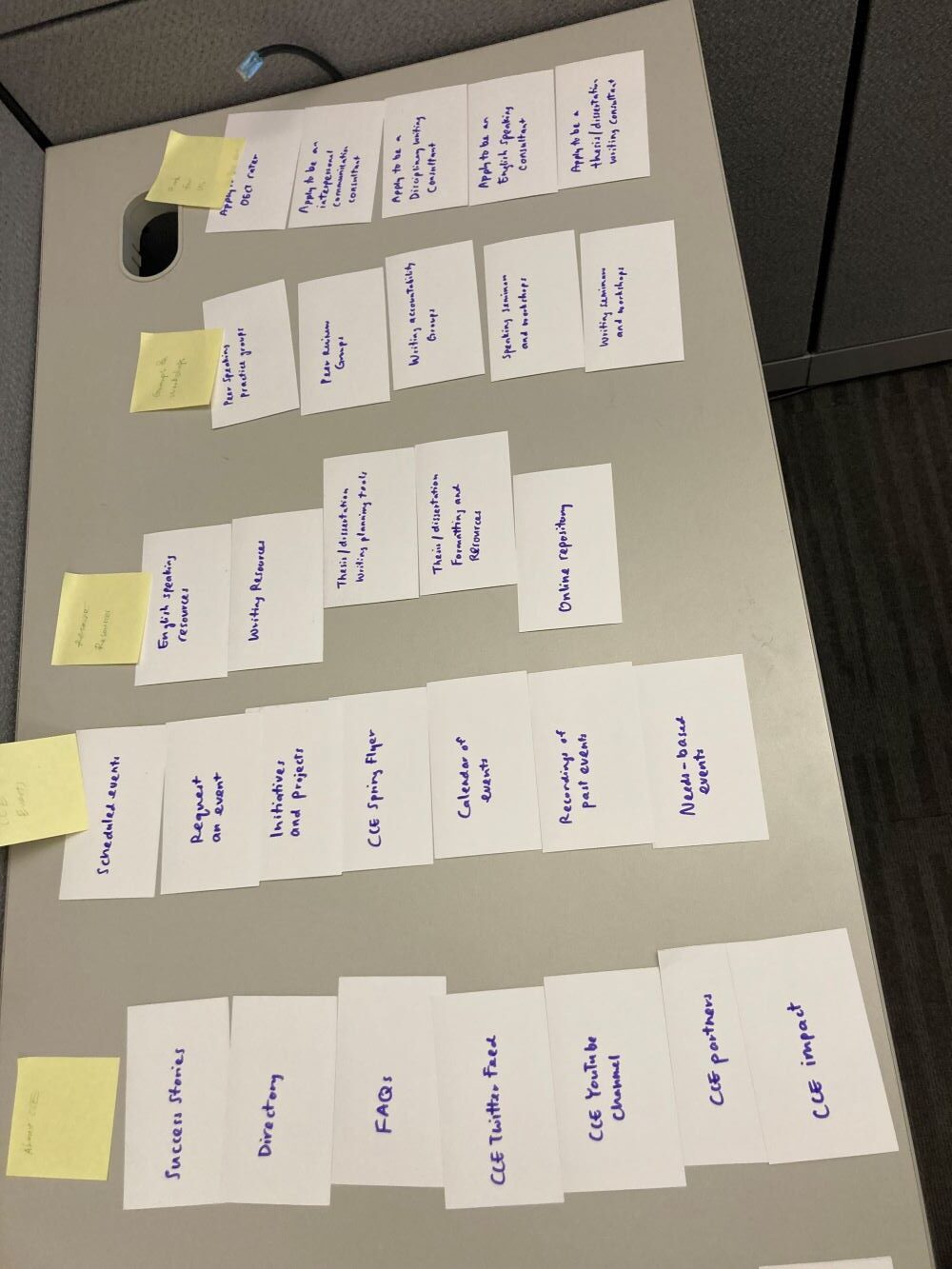
2️⃣ Conducted a Card Sort
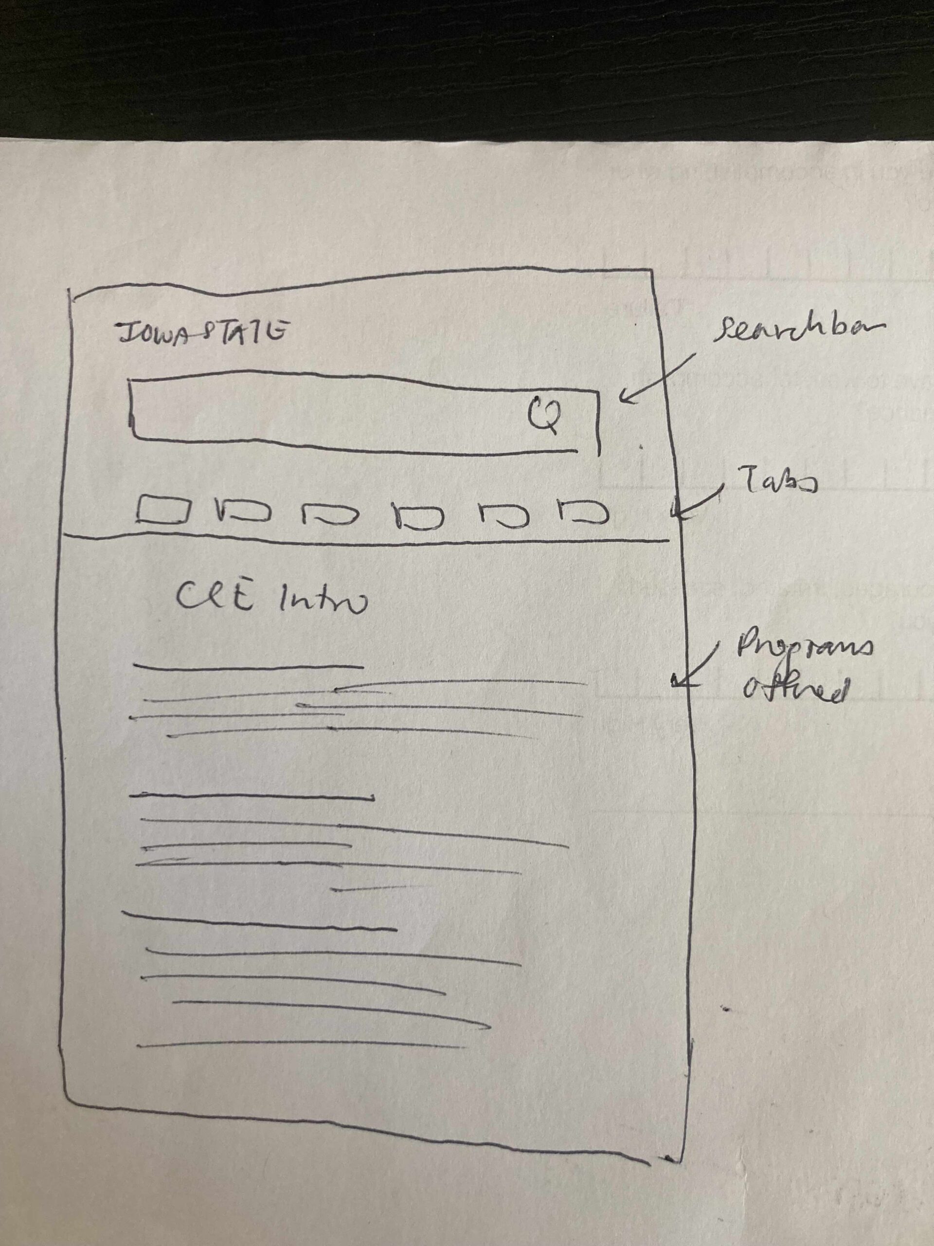
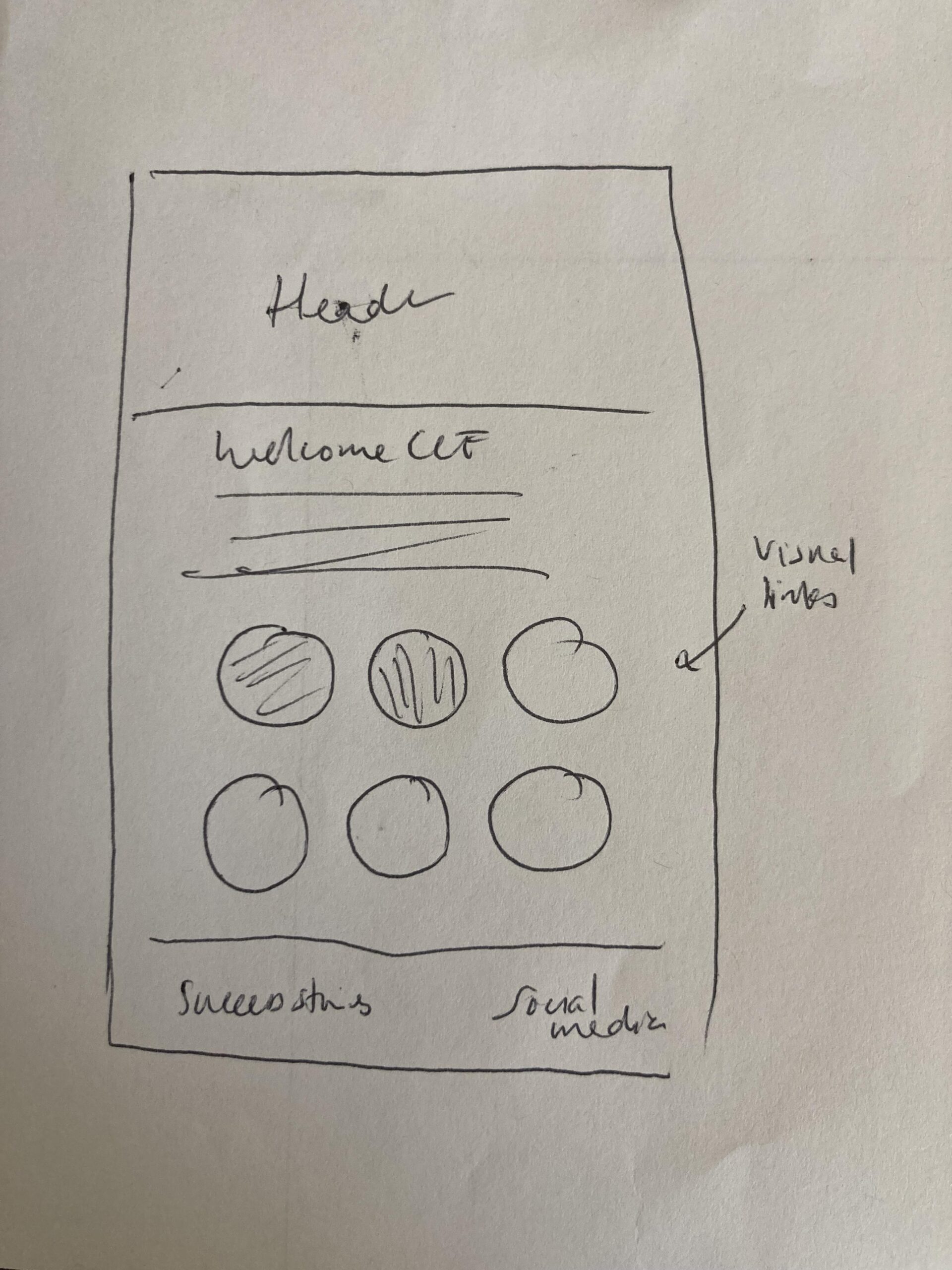
3️⃣ Rapid Prototyping and Testing
4️⃣ Front-End Development of Website
5️⃣ Stakeholder Alignment & Delivery
 Key output
Secured leadership approval after design reviews and cross-functional collaboration, ensuring the project met both institutional standards and user needs.
Collaborated with IT and marketing teams to finalize and align deliverables
Managed project timeline and milestones to ensure an on-time, high-quality launch
Facilitated clear communication between stakeholders and design team throughout the process